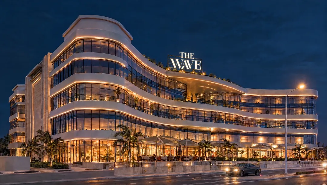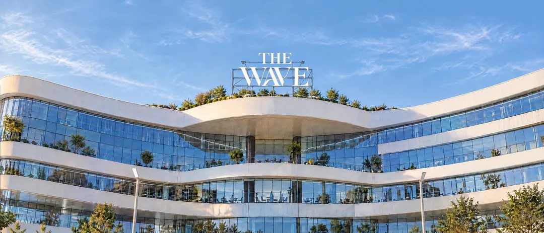
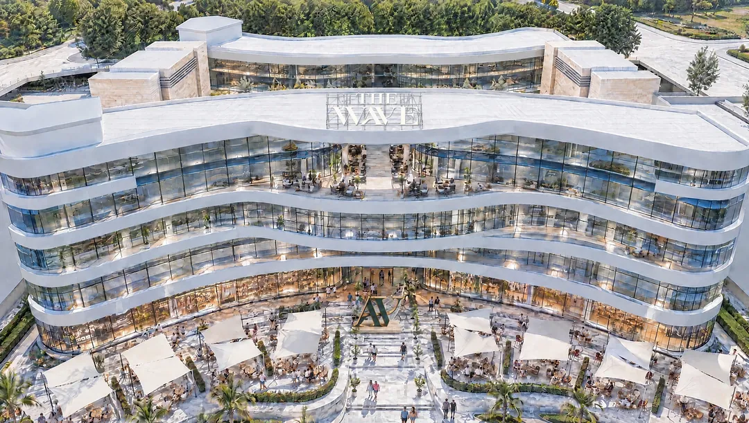
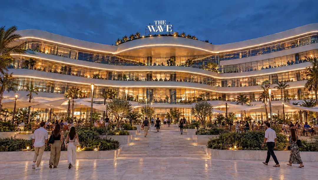
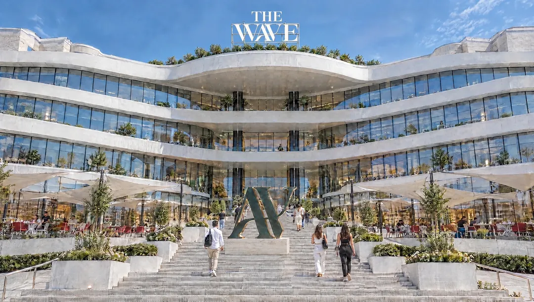
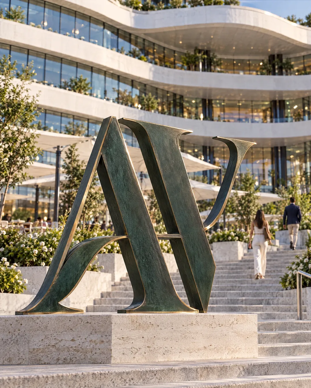
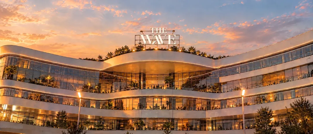
Look closely at the logo. Where the A meets the V, a single line rises and falls like the sea. It is the moment our name becomes a shape, and it is the whole idea of the place: somewhere that flows.
One stroke, two letters
The wordmark is set in a high-contrast serif, the kind you find on the cover of a fashion magazine. Thin hairlines, heavy stems, generous curves. We asked for one change: the crossbar of the A should not stop. It should carry on, dip, and climb into the V as a single wave.
That stroke now sits everywhere, from the façade signage to the stitching on a shopping bag.
Four colourways
The identity lives in four colours taken from the sea, the desert and the light of New Cairo: palm forest, cocoa, sea glass and desert sand. Each colourway pairs two of them, so the mark can sit on a dark storefront, a paper bag or a sunlit wall and still feel like itself.
A place that flows, drawn in one line.
The pattern
Repeat the A–V ligature, offset every second row, and you get a pattern that reads as water from across the room and as letters up close. You will find it on wrapping paper, in the lifts, and on the inside of the gift boxes.